View my
Art Portfolio
Having a background in art, here are a select collection of artworks that incorporate different mediums as well as art styles.
View
Sip' N' View
SIP' N' VIEW aims to provide an acessibile yet convenient experience for those who want to pre-order snacks at the movie theaters along with the option to pre-purchase movie tickets and explore other perks.
View
Uniwave
UNIWAVE aims to provide college students an easy and less formal way to network with their peers. Using the interface they are able to find students with similar interests or find job opportunities on and off campus.

View
$ense
$ense aims to provide new adults who may be living alone or managing expenses a way to track their expenses. It provides a user friendly experience wherein users are able to categorize and get analysis on their spending.
About Me
I am a college student with an interest in design and overlapping into the tech industry. I have knowledge in figma and Adobe XD, with the intent to carry out more UX projects into the future individually and as a team.
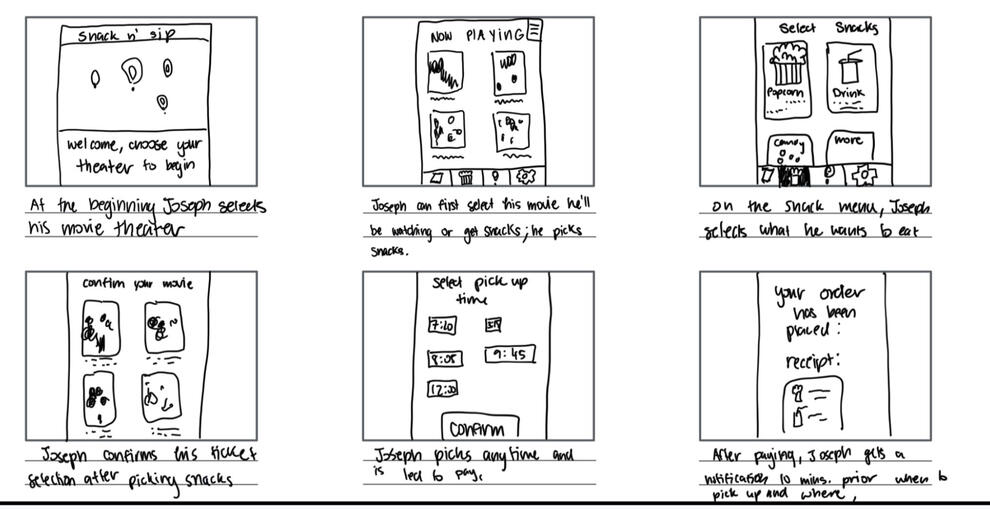
Sip'N'View
Entailed is the process behind creating, designing, prototyping, and polishing the app. Towards the bottom is the compiled case study, pressing on the image will lead you to an external link that documents the detailed process.
Ideation
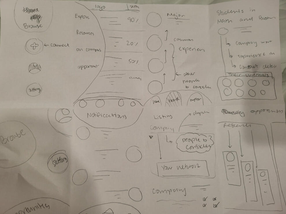
After researching and interviewing different personas, I mapped out an interaction a person who just recently immigrated to the US may interact with an app. Next, in 30 second intervals, I designed home screens that could be used for the app.
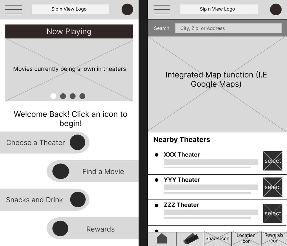
Wireframe
I decided to choose to make the navigation buttons rounded, and towards the bottoms to encourage users to press on the movie banner that would switch across the screen. Eventually these became the base for my low-fidelity prototypes wherein I conducted a usability study to see how I can improve upon design and function.
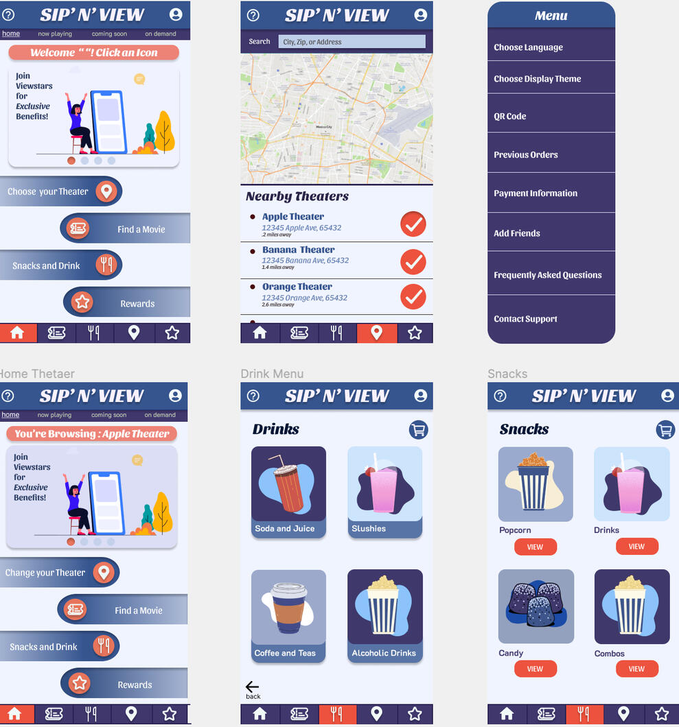
High Fidelity Prototype
Choosing complimentary colors helps draw attention to certain aspects of the app which is something I liked. I also decided to update everything with rounded edges to give the app a softer and more modern look.
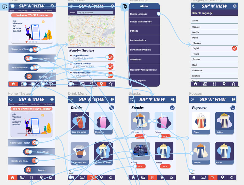
Interactions
There are interactions still yet to be added, however only some can be added with the use of coding--helping with the simplicity and cleanliness of the mockup.

UNIWAVE
Entailed is the process behind creating, designing, prototyping, and polishing the app. Towards the end, the case study is published--press to enlarge thumbnails and navigate with your arrow keys or mouse.
Ideation
In 30 second intervals, I designed a user journey throughout the app. The goal was to create something trendy, but simple enough for students to use. With the many dropdowns, I began to feel like the navigation would be difficult.
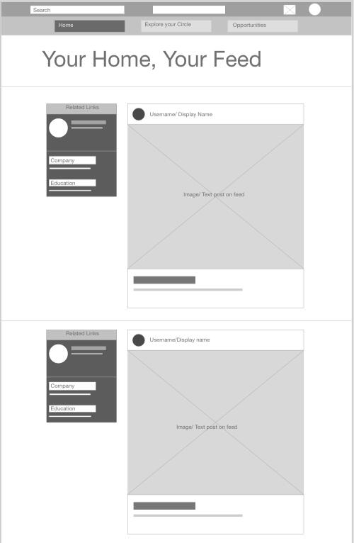
Wireframe
The product is supposed to run on a website, with a similar feed as social media apps. I added more angular edges and compartments to make the organization of the product clear for the user.
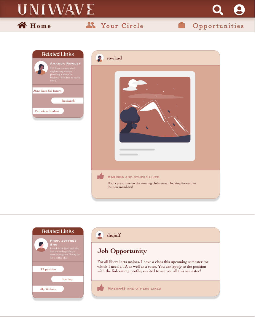
High Fidelity Prototype
I chose a somewhat monochromatic color scheme in order to make the app branding comprehensive and simple. Similarly, I rounded the edges, but added lines in order to compartmentalize the different aspects.
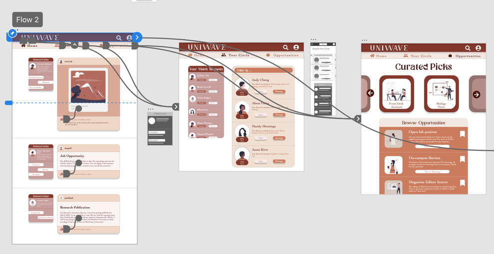
Interactions
There are interactions not completely shown here, however there are more functions I would like to add. I would propose being able to link this to a student website such as the unviersity's security so that the grouping of people is more secure to the university.

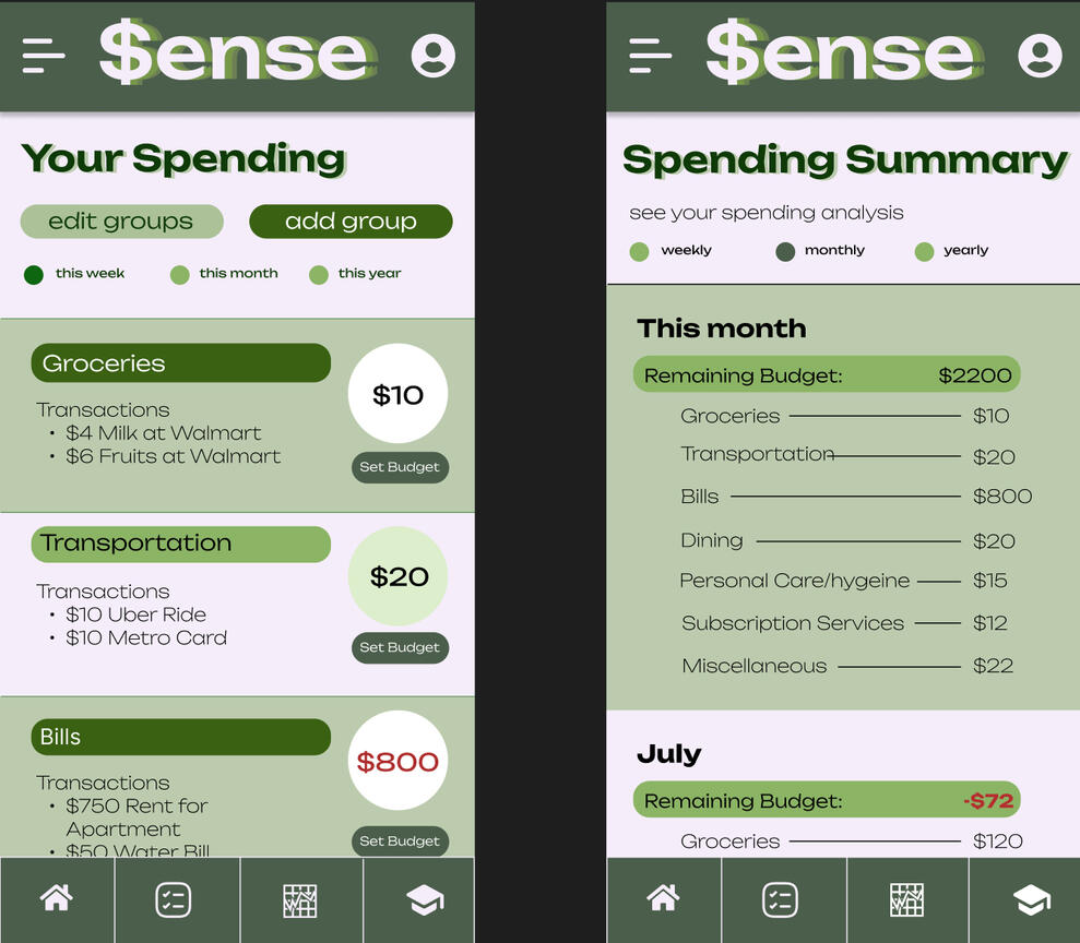
$ense
Entailed is the process behind creating, designing, prototyping, and polishing the app. Towards the end, the case study is published--press to enlarge thumbnails and navigate with your arrow keys or mouse.
Ideation
In 30 second intervals, I designed a user journey throughout the app. The goal was to create something trendy, but simple enough for students to use. With the many dropdowns, I began to feel like the navigation would be difficult.
Wireframe
I added the navigation bar at the bottom since that is what makes navigation the easiest. Additionally I provided a menu tab to make navigating easier, with multiple points to access a page.
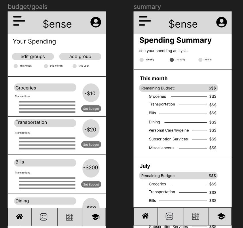
High Fidelity Prototype
Brushing up on the app and adding color, I eventually got the base for the app after several iterations. I also decided to add the color red to signify how far off the user is from the budget.
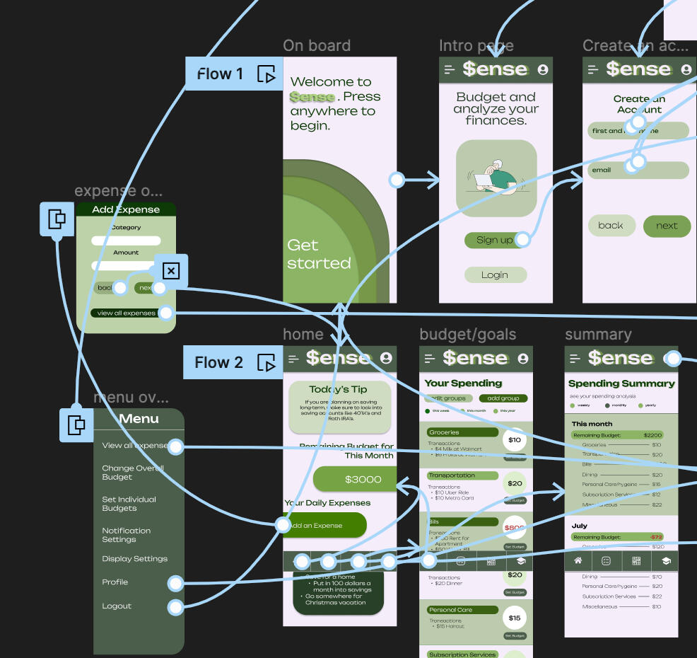
Interactions
There are interactions still yet to be added, however only some can be added with the use of coding--helping with the simplicity and cleanliness of the mockup.


Glass bottles 12 x 16 in

Ornament 12 x 18 in

Empathy 24 x 32 in

Apricots 10 x 16 in

Ballet Class 18 x 24 in

2:38 am 9 x 9 in

Mirrors 10 x 12 in

Metamorphosis 9 x 12 in

Lakeview 10 x 16 in

The recipient 16 x 20 in

garden 10 x 10 in


